
Data is Beautiful
More info https://www.nytimes.com/interactive/2022/06/22/us/shootings-police-response-uvalde-buffalo.html
Stolen from Reddit.
The big drop in the 1970's was supposedly due to a change in the program to de-emphasize outdoor activities. The step down in 2019 was the LDS church cutting ties and starting their own program.
If you consider this as a proportion of the population it's an even bigger drop. In 1970 there were about 4.8M scouts in a population of 205M, so about 2.3% of all Americans were in Boy Scouts. Now it's 1M scouts in a population of 341M, so only 0.3% of Americans are in Boy Scouts.
cross-posted from: https://sh.itjust.works/post/23749463
> Source: https://www.pewresearch.org/short-reads/2024/08/15/a-growing-share-of-us-husbands-and-wives-are-roughly-the-same-age/
Source: https://twitter.com/mediazona_en/status/1823670620065808557
▶️ Total olympic medals won in Paris 2024 and Human Development Index 🏅
➡️ https://www.businesstimes.com.sg/opinion-features/what-olympic-medal-table-really-tells-us
After reading the article we made this #boxplot using #LabPlot, an open source data analysis and visualization software.
The plot doesn't provide answers, it rather invites some thinking.
\#Olympics #Olympics2024 #France #China #USA #UnitedStates #UnitedKingdom #UK #Brazil #Australia #Japan #Italy #Canada #Germany #Italy #Netherlands #DataAnalysis #DataScience #OpenSource #FOSS
This chart has been floating around, and I find it interesting to speculate about the reason for this shift.
Have attitudes changed this much? Do teens have less independence or fewer places to go to do these things? Are parents more involved in teens' lives? Was vaping excluded in the study?
Source: https://www.reddit.com/r/dataisbeautiful/comments/1e7cy2x/mambo_no_5_was_released_25_years_ago_how_have_the/
Source OP's comment:
>Source: birth rates in the US, from social security card applications. Provided by SSA.gov. For the age ranges, we make the assumption that all women lived to exactly 73 years old, which is the life expectancy for females at birth in 1960. Therefore, the population in each age range will not be entirely accurate, particularly for 69+, but it nonetheless shows the trends of birth rates and popularity of these names over time. Tools: python, pandas, Vega>
https://geoffboeing.com/2018/07/comparing-city-street-orientations/
- • 100%
[Meta] For people interested in data visualizations, there is also !dataisbeautiful@mander.xyz
!dataisbeautiful@mander.xyz
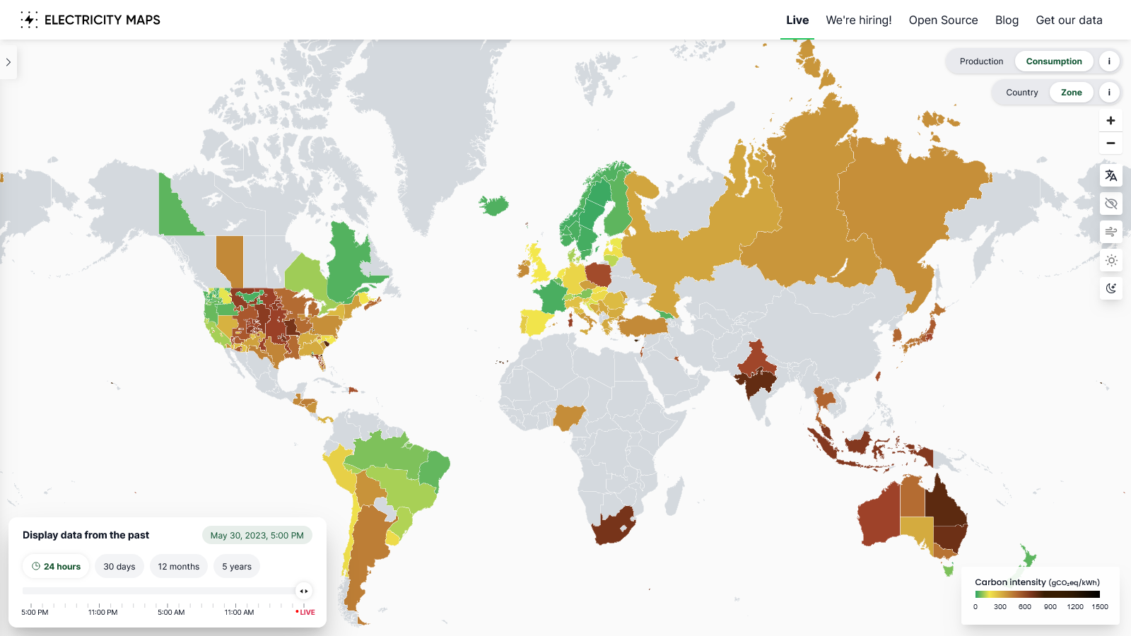
- • 100%app.electricitymaps.com Live 24/7 CO₂ emissions of electricity consumption
Electricity Maps is a live 24/7 visualization of where your electricity comes from and how much CO2 was emitted to produce it.
- https:// lazysoci.al /pictrs/image/88894d11-ad10-4c50-9cb5-9d5bbc9d321c.avif
cross-posted from: https://lazysoci.al/post/14613068
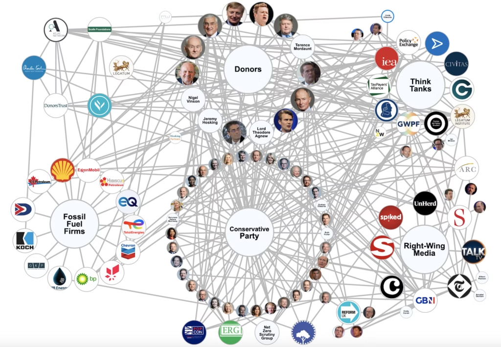
> Source: https://www.desmog.com/2024/06/12/mapped-tory-network-climate-denial-fossil-fuel-funding/
- tradingeconomics.com Japan Jobs To Applications Ratio
Jobs To Applications Ratio in Japan increased to 1.28 in March from 1.26 in February of 2024. This page provides - Japan Jobs To Applications Ratio- actual values, historical data, forecast, chart, statistics, economic calendar and news.
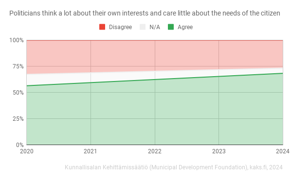
https://web.archive.org/web/20240518061606/https://kaks.fi/wp-content/uploads/2024/05/tutkimusosio-18052024.pdf
Finland dataset
Edit: final update for the viz, comments started with this
- wetdry.world Forgetful Bri (@forgetful_bri@wetdry.world)
Attached: 2 images · Content warning: data+
- • 80%www.visualcapitalist.com Airline Incidents: How Do Boeing and Airbus Compare?
This graphic shows U.S. airline incidents across the two largest aircraft manufacturers in the world as Boeing faces increased scrutiny.

cross-posted from: https://jlai.lu/post/6262433
> Airline Incidents: How Do Boeing and Airbus Compare?
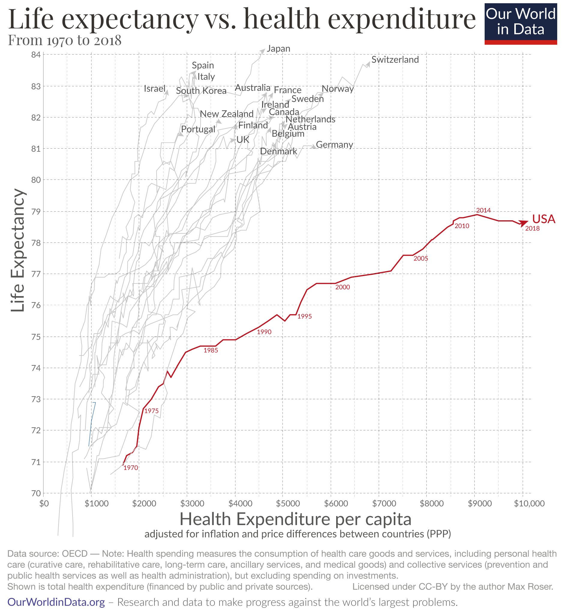
- ourworldindata.org Why is life expectancy in the US lower than in other rich countries?
Americans have a lower life expectancy than people in other rich countries despite paying much more for healthcare. What factors may explain this?
cross-posted from: https://lemmit.online/post/2699114
> Life expectancy vs healthcare spending of US compared to other developed countries > > ##### This is an automated archive made by the Lemmit Bot. > The original was posted on /r/dataisbeautiful by /u/dolekanteel on 2024-04-18 15:57:43. >
cross-posted from: https://lemmit.online/post/2699112
> ##### This is an automated archive made by the Lemmit Bot. > The original was posted on /r/dataisbeautiful by /u/JPAnalyst on 2024-04-18 15:16:16. >
https://bsky.app/profile/luckytran.bsky.social/post/3kps32vsbps2y
https://twitter.com/luckytran/status/1778090750107853015/
- https:// cdn.bsky.app /img/feed_fullsize/plain/did:plc:7widwi4mbmc67v6purqbq7sg/bafkreibku3eiggoenuttrsu2n3cuvzvfj3zk32c6gnpcjyxiyqekqxrap4@jpeg
cross-posted from: https://feddit.uk/post/9722518
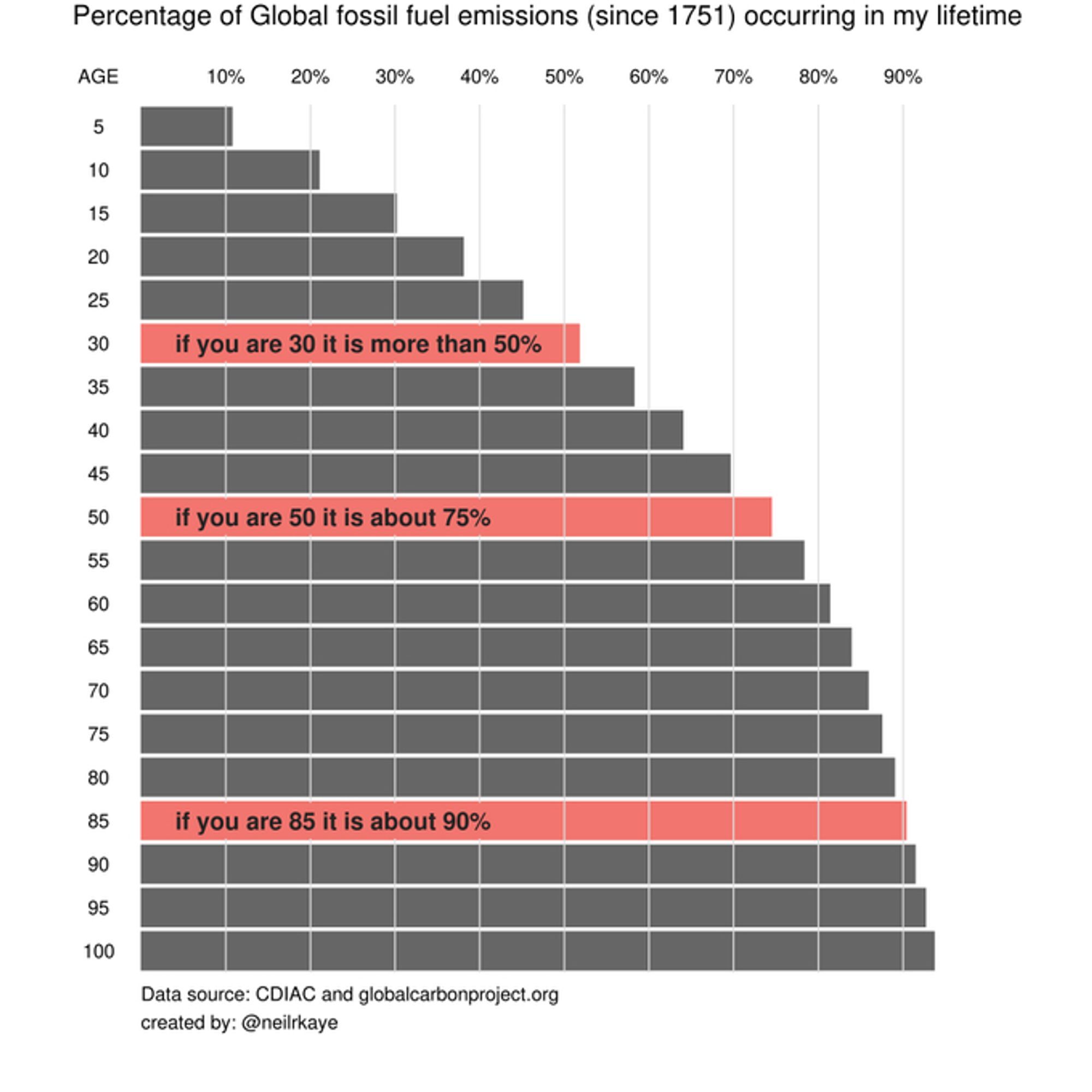
> > If you are aged 30 or more, then 50% of all human fossil fuel emissions happened during your lifetime. (by Neil Kaye) > > Source: https://bsky.app/profile/infobeautiful.bsky.social/post/3kopcy5lddn2e
- • 95%
Conceptual
- projects.propublica.org Nonprofit Explorer - ProPublica
Since 2013, the IRS has released data culled from millions of nonprofit tax filings. Use this database to find organizations and see details like their executive compensation, revenue and expenses, as well as download tax filings going back as far as 2001.

- www.visualcapitalist.com The World's Richest Countries Across 3 Metrics
Here's how the world's richest countries stack up by different measures of GDP per capita, including adjusting for PPP and productivity.

How do you measure the economic success of a country?
By one classic measure, GDP per capita shows individual economic prosperity. But comparing countries simply by this metric doesn’t tell the whole story. To get a better idea of living standards, it helps to look at how far your money will go along with adjusting for labor productivity.
This graphic shows the world’s richest countries by three different measures, based on data from The Economist and Sondre Solstad. All figures are in U.S. dollars.
The graphs are from the US Energy Information Administration's Hourly Electric Grid Monitor: https://www.eia.gov/electricity/gridmonitor/dashboard/electric_overview/US48/US48
The date format in the titles is month/day/year, but in the horizontal axes it's day-month-year. I apologize in advance.
Based on https://privacytests.org
Desktop browsers in their current stable versions, sorted from better (left) to worse (right). These are:
Librewolf, Mullvad, Brave, Tor, Safari, Chromium/Ungoogled, Firefox, Edge, Opera, Vivaldi, Chrome.
Note: Each test is counted with a value of one in this chart, however each test may not have an equal importance in regard to privacy. It still gives an image of which browsers value privacy and which do not.
The maximum (worst possible) score is 143.
Edit: Also FUCK BRAVE. But for other reasons than these points. Read the description before you vote or comment ffs...
The Washington Post article mentions a 1994 research paper by William Nordhaus as the source, but their link doesn't seem to work. Here's a working link to the paper: https://cowles.yale.edu/sites/default/files/2022-08/d1078.pdf


