Skip Navigation

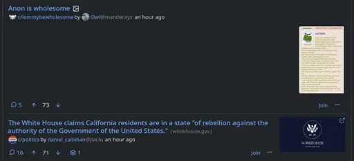
I've had a bit of a play and configured custom CSS to move the image preview, for Image posts, to the right, rather than centre. What I'd really like is for the preview to be smaller and up, inline with the header text, like the preview image from a Link post. In the attached example, I'd like the 4chan image text to appear similar to the whitehouse logo in the post below it. This would remove a lot of whitespace and condense the whole feed.

This is beyond my CSS ability. Is it even possible with custom CSS on the settings, or would it need a change to the backend?

2 comments
  • If I understand correctly, this would just apply to the intermediate level of compact layout? It doesn't really make sense to be right-aligned on the expanded media view.

    I think this would likely need to be a change implemented on the templates rather than just css (but I am far from a css whiz).

    • Yes - I should have noted that I'm using "Compact UI" = "Yes - thumbnails only".

      I should also add that the current layout has advantages. When scrolling other platforms in "mindless meme mode" it's frustrating to click on a thumbnail expecting to expand the image and instead following a link to an article.

      Ideally Image posts and other posts should appear subtly different in the feed - different enough that you know what you're clicking on, but not so different that they interfere with the visual flow of the feed page. I have no design skills and can't suggest how that might be implemented, but I'll know it when I see it :-)