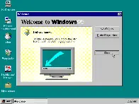
Windows 95 is a consumer-oriented operating system developed by Microsoft as part of its Windows 9x family of operating systems. The first operating system in the 9x family, it is the successor to Windows 3.1x, and was released to manufacturing on July 14, 1995, and generally to retail on August 24, 1995, almost three months after the release of Windows NT 3.51.
Windows 95 is the first version of Microsoft Windows to include taskbar, start button, and accessing the internet. Windows 95 merged Microsoft's formerly separate MS-DOS and Microsoft Windows products, and featured significant improvements over its predecessor, most notably in the graphical user interface (GUI) and in its simplified "plug-and-play" features. There were also major changes made to the core components of the operating system, such as moving from a mainly cooperatively multitasked 16-bit architecture to a 32-bit preemptive multitasking architecture, at least when running only 32-bit protected mode applications.
Accompanied by an extensive marketing campaign,Windows 95 introduced numerous functions and features that were featured in later Windows versions, and continue in modern variations to this day, such as the taskbar, notification area, and the "Start" button. It is considered to be one of the biggest and most important products in the personal computing industry.
Also, the part no one ever brings up: No per-program volume control. Ugh. That was so actively irritating until they finally added it (was it in XP? or not until 7?)
• no streaming/subscription fees
• no ads
• rocks have very wide adoption rates
• cave art can last thousands of years without power
• content is auto-saved without a dvr
• cave art programming is tangible, tv programming is not
I don't need insurance, I don't need no parkin space
and if you try to clamp my horse he'll kick you in the face
I don't pay no tax, fuck NCT
you'll arrive in style if you ride with me
Well. 4 MB was a bit of a stretch. I remember buying a RAM upgrade to 8 MB to get it to run decently. Cost me 200 DM on top of the 200 for the Windows upgrade. It was a huge leap compared to Windows 3.1, though. And this stuff just was a lot more expensive back in the day.
This has made a lot of people very angry and been widely regarded as a bad move.
Seriously though, this is the first properly good UI for a desktop computer. Mac OS (or I guess Macintosh OS at the time) was okay, but reliant on the global menu and weird drop-downs. Windows kept everything self-contained. Even multi-window programs tended to use the "multiple document interface," i.e., windows inside windows. Tabs weren't really a thing yet.
It also crashed if you looked at it funny and had the antivirus capabilities of warm cheese. But there's damn good reasons Windows 7 was the same experience, extended, rather than replaced. It's more-or-less what I style Linux to look like. And in light of that I'm kinda pissed off any OS ever struggles to remain responsive, when this relic ran smoothly on one stick of RAM that's smaller than my CPU's cache.
Thoroughly familiar with it; don't care. The global menu has always been goofy because of the invisible relation to some open window. Usually a small window floating out in middle of the desktop, because Mac OS took forever to adopt any concept of "maximize." I'm still not sure they do it right.
In its basic form, Fitts's law says that targets a user has to hit should be as big as possible.
Dear god, my biggest beef with using a smart phone is that UI designers 1) love to have tiny buttons for shit, and 2) the tappable areas for those buttons are almost never made larger than their tiny graphics, so it's a bitch to actually tap them.
I used to be a mobile app developer, and when I wrote apps by myself I would always expand the tappable areas so they were easy to hit with fat fingers. My last job was working for a huge cable company (maybe the name rhymes with "bombast") and whenever I expanded the tappable area of a tiny button the UI designers would pitch a fit and insist that that not be done. Management would agree with them on the grounds that expanding the tappable area would require too much time to implement - and then they'd order me to spend even more time un-implementing it.
The full screen app contained in a single window was great! I hated the Mac eat fo many windows floating around. My ADHD was so overwhelmed by all the tiny windows instead of a clear one.
I already had one of those fancy new-fangled CD-ROM drives. You could get a computer magazine with a cover-CD and it had all the patches for all current games and major software packages. So cool.
You weren't stoked for XP? XP is the OS that got me into computing. Before XP computers were a novelty to me. When XP came out they finally seemed powerful enough to accomplish cool things with.
I learned a lot with XP because it required constant trouble shooting. Was a buggy mess imo. I was more excited about hardware advancements and cool games at that time.
My dad barely knew how to run things in windows 3.1 but he still regrets the day he installed windows 95 because it was all downhill from there when it came to him knowing what was going on.
Microsoft marketing hasn't gotten any better about song choices. A few years ago their ads had soft bleep-bloop tunes and "go baby, go baby, yeah we're right behind you."
The song is "Cherry Lips," by Garbage. It's the twink anthem.
And it's still not as tone-deaf as whichever Bill Hicks target picked out "hey ho let's go" from the god-damned "Blitzkrieg Bop."