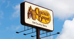
Cracker Barrel will go back to old logo after conservative backlash
Cracker Barrel will go back to old logo after conservative backlash

www.nbcnews.com
Cracker Barrel will go back to old logo after conservative backlash
Cracker Barrel will go back to old logo after conservative backlash
Cracker Barrel will go back to old logo after conservative backlash
No bigger snowflake than a MAGAt.
I am so sick of these whiny snow flake conservatives and their complete lack of self-awareness.
The reaction has been absurd, but their new logo was definitely awful.
It was fine, Jesus Christ
Kinda wish the public had a similar outrage when Fruit of the Loom modernized their logo in 2000, lol
I just wish they didn't try to gaslight humanity into believing there was never a cornucopia
I'm more upset about Mr Pringle.
Lost not only his hair, but the twinkle in his eye, poor chap.
I don't think that the old logo is great either, and the update did improve on technical aspects. You don't want to have all that small text, for example. And generally, simpler logos are preferable.
But...their shtick is a rustic feel. Whatever you can say about the original logo, it did evoke that. I have a hard time seeing the new one doing that.
EDIT: I also think that this compares favorably to another controversial recent rebrand: Musk rebranding Twitter, which was generally seen as not a good idea; Twitter already had a strong brand identity. People weren't happy and Musk went right ahead with it regardless. At Cracker Barrel, the initial response was "calm down, it'll be okay", but they were willing to second-guess themselves, even though I expect that there were people there who were invested in the rebrand.
EDIT2: They'd also done smaller, more incremental changes to the logo in the past, because the "Old Country Store" text had had its typeface changed at some point in the past.
EDIT3: Here's a more-comprehensive history:
According to another site, the logo was 1977, not 1997. Which tracks with another article mentioning a marketing person coming up with the design in the 70s
I do find it amusing that the “classic” logo everyone is pining for is from the “ancient” year of 1997…
On the long drive to and from vacation last week I noticed the 2024-25 picture used a lot and I thought wait they already have a version without the other stuff and it looks fine so why the hell are they changing it again when its perfectly fine the way it is? My biggest complaint of the newest one was just that it featured no border. It already looked weird, but without that border, it just didn't work at all.
How was it awful?
Could you tell me what the heck this yellow blob shape is supposed to be?
From a purely graphic design perspective, the classic logo is too busy and doesn't scale well. The only thing it has going for it is the weirdness of the shape and the distinct color combination. It's technically a really bad logo. You may not prefer the new logo but, technically, it's a whole lot better. It's far more adaptable to newer platforms while stilling being recognizable. Now, as far as being an effective representation of the brand and if that's a corporate concern, I don't know that I can comment on that.
In another post about this, someone posted a bunch of other fast food logos, and they all looked very much the same, especially in silhouette. They're all just a same-y blend of mediocrity, whereas the existing logo was at least unique.
McDonald's probably has the best and most distinctive logo out of anyone.
Yellow blob is obviously a speech bubble.
The yellow blob is a pinto bean. :)
100%, right here.
Thank god! Now can we get back to the important issues? How's that WAR ON CHRISTMAS going?
The war on Christmas CANNOT END until Christmas ceases its illegal occupation of November.
We are once again calling on the Claus regime to return to their side of the borders outlined in the Black Friday agreement.
November? I think you forgot to include September and October.
I've already fired my first salvo. By now I would have had at least three or four gifts already purchased and ready for the Christmas season. I haven't even bothered. And I won't. It's going to be a lean Christmas and it's going to hurt the capitalist assholes who are fucking up our country.
So the war on Christmas is odd on a theological and economic level. The secular (pagan?) Side is driven by corporations not the woke left. A fact often ignored by the evangelical right.
So what solution do they even want? A commercial with Jesus on the cross saying he thirts and having a Roman soldier pass him a chilled and refreshing coca cola?
Maybe a nativity where one of the wisemen is like and we got something for Joseph too and hand him a power saw?
Wtf
I just want people to start complaining about "x-mas" again so I can explain very slowly what the Greek letter Chi is.
Good luck with that. The explaining part, I mean.
I've had xtians hound me on various forums for using their own abbreviation, LOL. Even after explaining it to them, they'd still get worked up into a poutrage, deny what I told them, which was obviously true, and, at least on Denver Post forums, run to the mods to try to get me banned and/or my posts taken down.
Complained about the redesign, isn't Conservative How dare you insult me like this? I am an American and I will not stand for being called a Nazi.
I've never seen people freak out so hard over a LOGO change. Jesus, it's not like they changed the typeface to Comic Sans or Papyrus or some shit!
Nothing wrong with Comic Sans. It’s highly readable for many people.
Jaguar cars: am I a joke to you?
Jaguar was less about the logo and more about that whole marketing campaign. It was like they were doing a cologne commercial and left out the car completely. The logo change was the least of it.
When we did finally see the car, it looked like an AI generated concept, not an actual car. :(
It was really shit rebrand though
Because everything in the United States has been turned into "us vs them" crap.
Bunch of snowflakes wanting their safe space
This is what happens when the media no longer does news but goes begging for clicks with rage bait. All it does is incentivize stupidity and lack of nuance. This country just keeps getting stupider and it’s only going to get worse the way they’re destroying the education system.
Was it really conservative backlash? I don't think anyone liked it, lol.
The general reaction may have been negative, but the conservatives went unhinged accusing the new logo of being "woke"
The news sells better and is more engaging when you put it is conservative backslash instead of just overall negative reaction
Especially on this platform
Non-conservatives give a shit about cracker barrel?
People talked about here a lot, I had never even heard of it before
I gotta meet up with the old people in my family somewhere. I'm not having them in my house are you crazy
Uhhh, there's a shit ton of Cracker Barrels in NY, going to Cracker Barrel for family meet ups and shit was a staple in my family and made precious childhood memories for me, and we're black as hell. Plenty of non conservatives love CB. There's a shit ton black people makes jokes online rn about missing the "segregation" vibes of CB.
I'm a Leftist Progressive living in North Carolina, and I like Cracker Barrel
Nope
I think I went there twice before they shut down here. I mean, it wasn't AWFUL. I'd rather eat at a local place though.
https://www.pignpancake.com/our-story.html
I only learned about it when I saw headlines about the backlash that was costing them millions.
My first reaction after figuring out it was not the Onion was....are they still in business? I honestly didn't know they were still operating. I looked on the map in the Denver area and the one I thought was in Littleton/Lakewood area either is a figment of my imagination, or they closed.
Just from a design perspective, there was too much wasted space
Yes. It was.
[Other Party]’s general population is totally upset about something [Our Party] thinks is good or even doesn’t give a fuck about!
We must be reactionary over the most trivial stupid shit and bicker and deflect from [List of Enormous Issues and Catastrophes], and create a new issue for everyone to point fingers about!
/s
Personally, I think it looks terrible and I’m a die-hard lefty/socialist/liberal whatever you wanna call me. I don’t eat there and don’t give a fuck about them, but this media attention over this “controversy” has pushed me to form an opinion on something I wouldn’t otherwise care about — and honestly if conservatives hate it, then fuck, I agree with them for once because it looks fuckin’ soulless and terrible lol.
Called it. They new coke'd that shit.
Just what we needed. Conservatives feeling even more empowered. Goddamnit.
Maybe this success will inspire them to redirect their attention from politics to corporate branding practices.
I wish they would target Netflix and their recent UI update next.
Why? You want the Washington Redskins back
Conservative backlash? Are we really putting all the apparent public distaste for the rebrand on the conservatives? I personally haven’t seen any conservatives or conservative-coded people complain at all; in fact, I thought the “outcry” (more like grumbling imo) was bipartisan and something that progressives and conservatives both disliked.
But again, I feel as though in a reaching effort to make conservatives look even worse than they already do, many democrats and associated talking heads are forcing this story that conservatives are so pissed about it.
I’m left as hell and voted for Harris so I hope that gives some perspective when I say that I also think the logo and overall brand look like tasteless, soulless corporate slop. It’s what all corps have done and will always do, simplify and dilute any individuality to appeal to the broadest possible market possible, and we shouldn’t applaud that.
IDGAF about Cracker Barrel and never eat there, and were it not for media pundits accusing conservatives of being pissed, I don’t think I ever would’ve known. That said, if it’s gonna be pushed in my face for brand awareness and marketing, then yea, it looks like shit and I want to eat there even less than before.
Congrats everyone, you’re falling for engagement bait and doing the advertising for Cracker Barrel for free.
Don't you know there are only two opinions in the world? Conservative and Liberal. Everything is neatly sorted into those two opinions. All questions, physical items, debates, people, opinions, foods, roller coasters, pickles, etc. All of it is Either Conservative or Liberal. Democrat or Republican. Whig or ...torry? I dont know. I mean, how could a rational human like fried chicken, grits, antiques, etching style line art, biscuits and old-fashioned candy without also hating Mexicans and hating killing babies?
Yeah I don't think it's actually a Republican thing. Maybe their locations just overlap with Republican areas?
Personally I think the new logo is dumb, but I've also never even seen a Cracker Barrel in real life, let alone patronized one. I'm not even sure what their business is. Retail? Restaurant?
It was both a retail store and restaurant. Both sections were “Southern Hospitality” themed minus any confederate or hateful shit. Think biscuits and gravy, maybe some bluegrass, farmin’.
I went a decent amount with my fam as a child and I always found it cozy and interesting. Never been as an adult.
The new logo did not go over well in some spheres, and on social media, conservative critics accused the restaurant chain of abandoning its traditional values or of being "woke."
When someone uses the word ‘woke’ as an unironic insult, I’ll probably think it’s stupid, but at least I understand what they’re saying. Until now, that is. What the fuck is “woke” supposed to mean in this context? What makes this bland logo change “woke”?
There was a man on the old logo and no man on the new logo. Totally woke.
What the fuck is “woke” supposed to mean in this context? What makes this bland logo change “woke”?
Woke is anything that I don't like.
They had some lgbt hires and dei stuff a few years ago and the ceo and is a woman so the new logo is clearly the end result of all that woke (reading: anything not catering to straight white males) nonsense
This was always the plan.
They only did the this to get their name in the news and get some people talking about them again to increase revenue.
conservatives are anti-progress.
Also, Cracker Barrel sucks.
Also my take. Who the fuck cares?
Huh. I guess crackers like representation too.
When my kids were young they started calling cracker barrel "the honky bucket". It just stuck as the name. I think they should add that to their logo.
Go figure. The people that hate change hated it enough to force a corporation to keep their logo.
Hope they didn’t have too much of the rebrand printed and ready to go…
Narrator: they did
I thought this was the onion 100%
I thought the same thing when I first saw the headlines about them losing millions over a logo change. The mind reels.
The occult community often compares sigils and corporate logos as being very much the same thing, but....DAMN. That's one hell of a spell that was cast over a whole lotta dumbfucks.
I frequent various chains, and I'm trying to think about the last time I really gave one fuck about any of their logos. I'm sure some of it works on a more subliminal and pernicious level, but have I ever sat back and really gave myself heartburn over a corporate logo? Hell to the fuck no.
🌨️
❄️
Mm
Government bailout...
Well, that's the last time I visit a Cracker Barrel. Oh Well.
Why? Because they decided not to rebrand? Sounds like you just want an excuse not to go there. You don't need one.

Were it not for the whiny fucking losers and their incessant bitching and moaning over everything, I wouldn't have know nor cared.
I still don't care.